
Don’t Let a Slow Mobile Site Kill Your Rankings...
Mobile Matters: Why Your Website Must Be Mobile-Friendly for East Wenatchee SEO
If your site’s clunky on mobile, you're losing leads. Get the tools and tips to dominate East Wenatchee search from any screen.
🔥 Introduction: The Smartphone is the New Front Door
Today’s customers aren’t waiting to get home and open their laptops. They’re searching, clicking, and calling directly from their phones—while waiting in line, on the couch, or even walking downtown East Wenatchee. If your website isn’t optimized for that moment, you’re invisible.
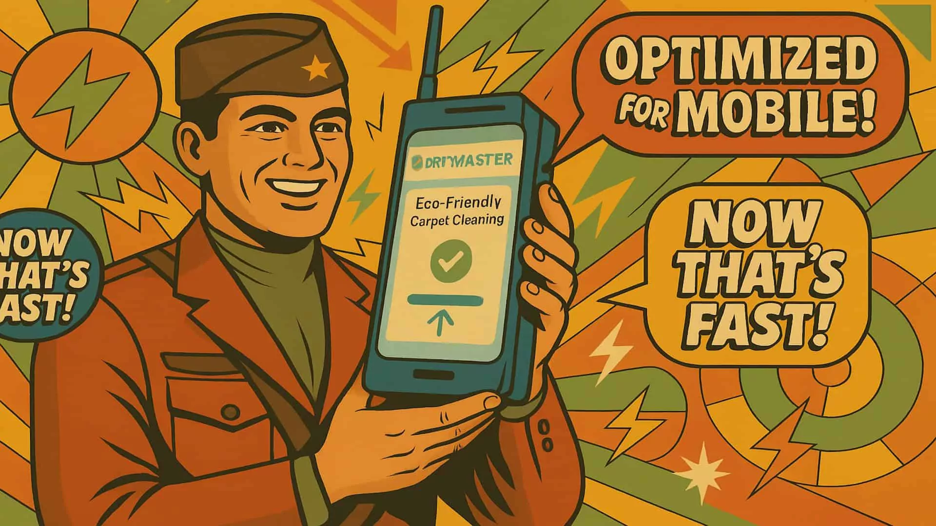
Mobile-friendliness is no longer a nice-to-have. It’s the foundation of a competitive online presence—and Google agrees. The search engine now uses mobile-first indexing, which means it ranks your site based on how it performs on phones, not desktops.
If you're a small business in East Wenatchee, mobile SEO is one of the easiest and most cost-effective ways to rank higher, convert faster, and stay ahead of the curve.
📊 1. What Is Mobile Optimization—Really?
A truly mobile-optimized website goes beyond simply "shrinking" your desktop site. It’s about delivering a smooth, fast, and friction-free experience for mobile users.
✅ Responsive Design: Your site should automatically adjust layout, fonts, and images to fit any screen size—whether it's a phone, tablet, or foldable device.
✅ Readable Text & Clean Layout: Visitors shouldn’t have to zoom in to read anything. Fonts should scale automatically and be legible without squinting.
✅ Fast Loading Time: Mobile users often rely on slower networks like 4G or public Wi-Fi. Every second matters.
✅ Tap-Friendly Navigation: Buttons and links must be easy to click without pinching or mis-tapping.
✅ Simple Forms: Nobody wants to type 10 fields of data on a phone. Cut the fluff and focus on essentials.
✅ Action-Oriented Design: Add sticky buttons like “Call Now” or “Book an Appointment” that follow the user as they scroll.
A mobile-optimized site doesn’t just rank better—it performs better, too.
🚫 2. Signs Your Site Isn’t Mobile-Ready
You might think your site looks “fine” on a phone. But a few critical flaws can quietly ruin your user experience—and your SEO.
Here are red flags to look for:
❌ Tiny Fonts or Zoom Required: If visitors need to zoom in to read your content, Google flags your site as not mobile-friendly.
❌ Buttons Too Close Together: If users frequently tap the wrong thing, it increases frustration—and bounce rates.
❌ Slow Page Loads on Mobile Data: A beautiful desktop site filled with uncompressed images can be a snail on 4G networks.
❌ Cluttered Navigation: Dropdowns that don’t collapse well on mobile waste precious screen real estate.
❌ Pop-Ups That Cover Content: Intrusive pop-ups or cookie notices that block mobile content can kill engagement.
🧪 Quick Test:
Use Google’s Mobile-Friendly Test to see how your site performs. It’ll show you exactly what to fix.
🛠️ 3. How to Optimize for Mobile SEO (Without Hiring a Developer)H3 Goes Here
Here’s a breakdown of practical, budget-friendly steps you can take right now:
🔧 Use a Mobile-Responsive Theme or Template
If you're on WordPress, Squarespace, or Wix, switch to a theme that’s labeled “mobile responsive.” It automatically adjusts layouts for different screens.
🖼️ Compress Your Images
Before uploading any images, compress them using tools like TinyPNG or ImageOptim. Consider switching to modern formats like WebP for even smaller sizes.
🚀 Install a Caching Plugin
If you're on WordPress, plugins like WP Rocket or W3 Total Cache can drastically improve load times by serving static versions of your pages.
👆 Design with Fingers in Mind
Make sure your buttons are large (at least 44px by 44px) and well spaced so users don’t accidentally click the wrong thing.
🧾 Simplify Your Forms
Keep contact or quote forms minimal. Name, email, and phone number are often all you need to get the lead.
📱 Add Sticky Call-to-Action Buttons
Make it effortless to call, schedule, or message your business from any screen—especially the homepage and service pages.
🌍 4. Why Mobile Optimization Is Critical for Local SEO in East Wenatchee
Here’s the local reality: most people searching for services in East Wenatchee are doing it on mobile. If someone Googles “dentist near me” or “best realtor East Wenatchee,” they’re likely looking for instant action. That means:
Calling your office
Getting directions
Reading your reviews
Visiting your site right then and there
If your mobile experience is clunky, you lose the lead. Worse, Google will push your competitor’s mobile-optimized site above yours.
Having a mobile-friendly site means:
You appear higher in Google’s Local Pack
You convert more local traffic into phone calls
Your bounce rate stays low—boosting rankings further
A fast, responsive mobile site is one of the most important ranking signals for local businesses in 2024.
✅ Conclusion: Mobile SEO Is Mission-Critical
Think of your mobile site as the front desk of your business. Is it friendly? Fast? Easy to work with?
If not, you’re leaving money (and customers) on the table.
With just a few changes—like faster load times, bigger buttons, and simpler layouts—you can climb local rankings, build trust with mobile users, and win more leads from East Wenatchee customers who are searching on the go.
❓5 Frequently Asked Questions
What is mobile-first indexing and why does it matter?
It means Google ranks your site based on how it performs on mobile devices. If your mobile site is slow or broken, your search rankings will suffer—even if your desktop site is perfect.
How do I check if my site is mobile-friendly?
Use Google’s Mobile-Friendly Test tool. It gives instant results and lists exact elements that need fixing.
Does having a responsive theme guarantee mobile SEO success?
No. It helps, but you also need fast load speeds, optimized images, and streamlined content for the best experience.
Can I improve my mobile site without rebuilding the whole thing?
Yes! Start with compressing images, simplifying navigation, reducing pop-ups, and improving call-to-actions.
How often should I test my mobile site’s performance?
Check it quarterly or whenever you make big design changes. New plugins or updates can impact speed and usability.
GSD Local
130 11th St NE
East Wenatchee, WA 98802
(509)-433-7730

© 2025 GSD Local
Services
- Local SEO
- Schema Markup
- ClipCred Video Marketing
- Website Design
- Copywriting
- Social Media Management
- Google Business Profile Mgt
- Press Release